There is so much we can learn by studying Mid-Century Modern home designs. For example, strategic overhangs and window placements offer passive solar heating and shading. Mid-century moderns will typically put an emphasis on natural lighting and proportionately scale the height of rooms based on their functions and sizes. Here in Connecticut, a traditionally “colonial” state, there are many great examples of mid-century modern homes built during the 60s and 70s.
Looking beyond the well-known structures, such as Philip Johnson’s “Glass House”, we find a plethora of mid-century modern homes spread throughout Connecticut’s suburban landscape. These houses are unique from one another and represent many different principles of mid-century modern design. Some of them have simple shed roofs with large windows opening towards a view. While others have expansive living rooms with exposed post-and-beam structures and high clerestory windows.
Here at studio.bad architects, we have had the pleasure of being commissioned to design additions and renovations to some of Connecticut’s hidden mid-century modern homes. In this week's studio session we want to introduce you to an exciting mid-century modern renovation that emphasizes how small strategic design moves can enhance the positive elements that already exist in your home’s design.
Tucked away in the hills of Simsbury, Connecticut, the existing structure of this mid-century modern boasted a lovely wooded site, open floor plan, and high clerestory windows. Our clients, a young family from Michigan whose careers brought them to Connecticut, loved many aspects of the home but felt there were some changes that needed to be made to meet their space requirements and the site features they enjoyed most.
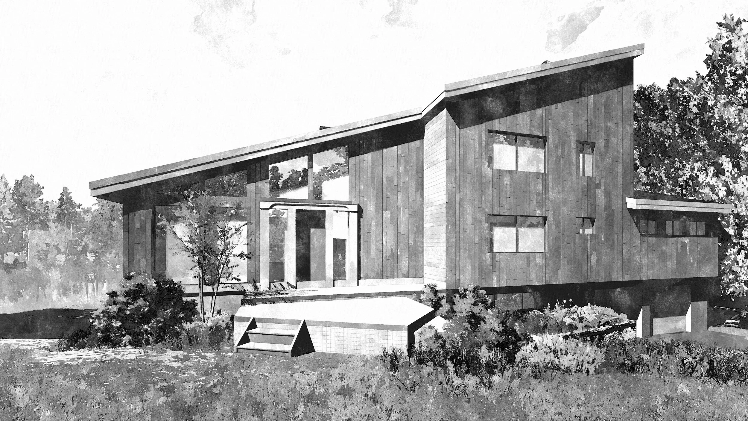
One of the disappointing features of the original design is the large sloping roof. The roof was not as disappointing aesthetically as it was functionally. On the lowest point of the roof (seen on the left of the image below) sits the living room. Beyond the solid and short exterior wall is an expansive view of the Simsbury foothills below. For unknown reasons, the existing design turned its back on this view:
Existing mid-century modern residence, Simsbury, Connecticut
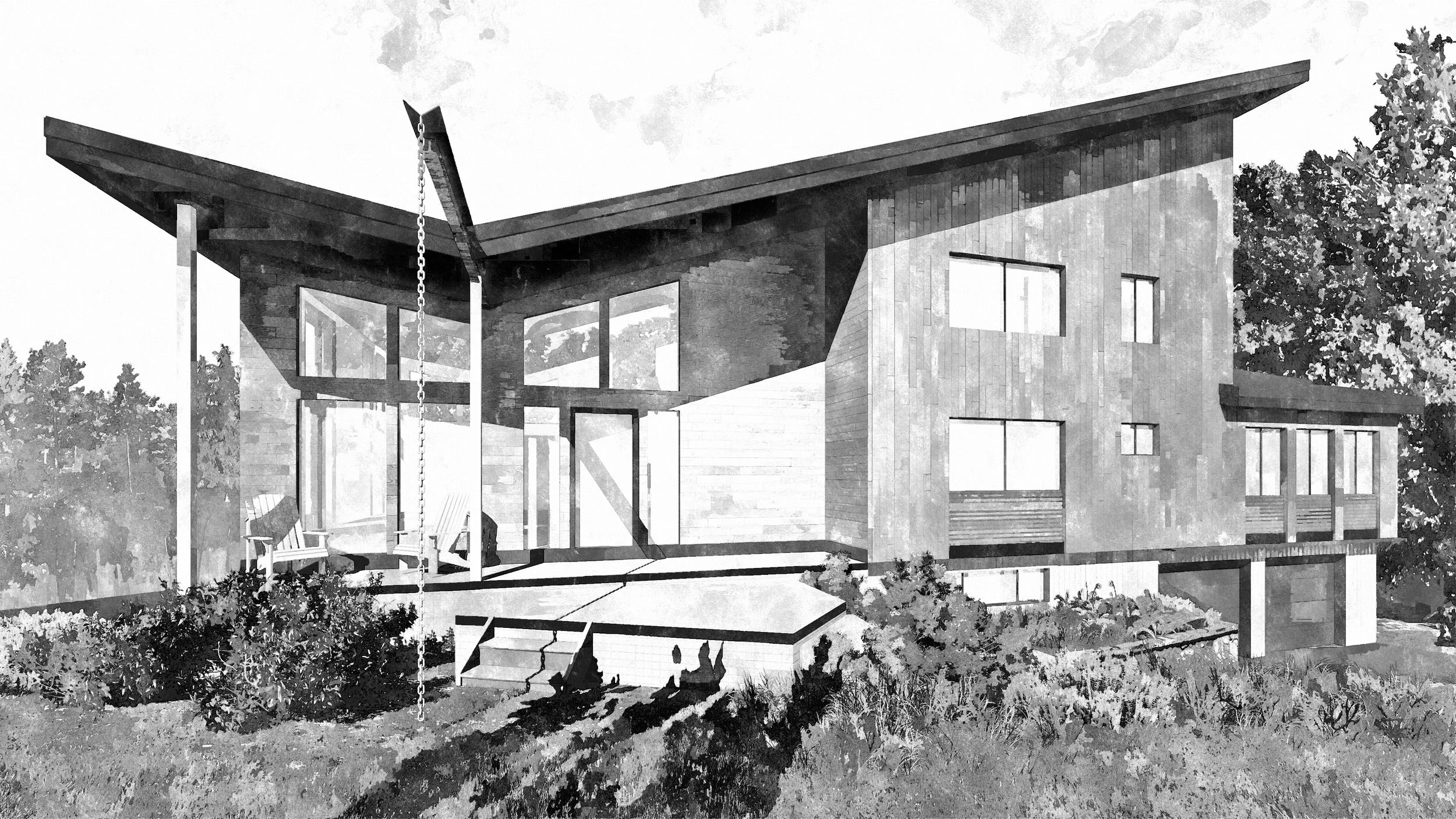
For our first pass at the design, we looked to emphasize the view and entrance of the home (left side of the image) by altering the pitch of the existing roof and creating a “butterfly” roof. Additionally, small enhancements to the existing windows (right side of the image) help to tie the composition together.
First pass at the exterior design...
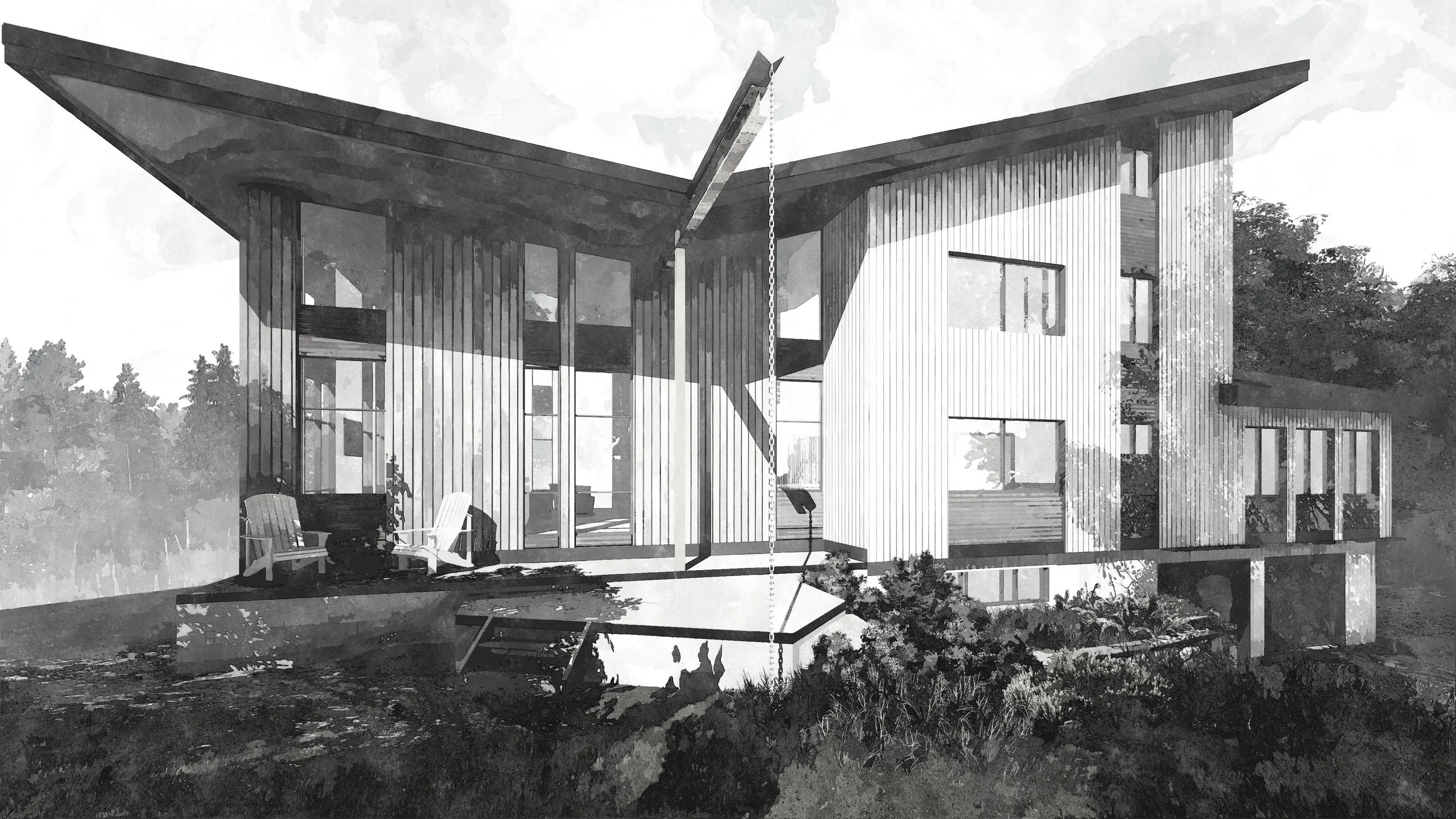
After discussing the above design with our clients, a desire to make the new views visible from other parts of the home slid the center of the “butterfly” roof which resulted in a better balance. Additionally, more minor material modifications to the existing windows help to reduce the scale of the existing roof peak.
Final exterior design...
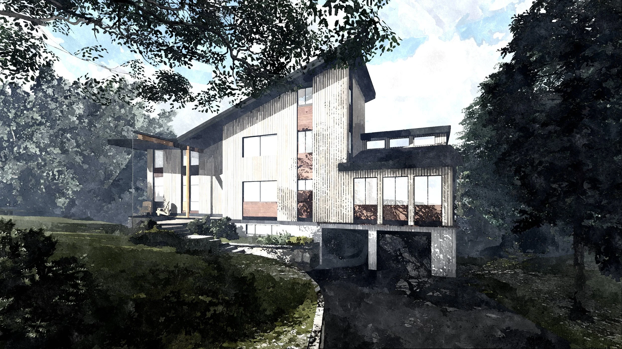
To get a better sense of the scale and approach to the home we rendered an image of how the home will look from the driveway entrance.
Exterior view of residence from entrance driveway...
Ultimately, this design illustrates how minor exterior material enhancement and changing the pitch of a roof can enunciate the positive aspects of a mid-century modern while taking advantage of a missed opportunity from forty years ago.
Click here to see more of our “mid-century makeover” project in Simsbury...
In the next “mid-century makeover” studio session we will dig deeper into the floor plan and how existing “obstacles” can become opportunity.

